07
- type promotion
- editorial design
- juxtaposition
- bold
- uncover
- order & chaos
- dynamic
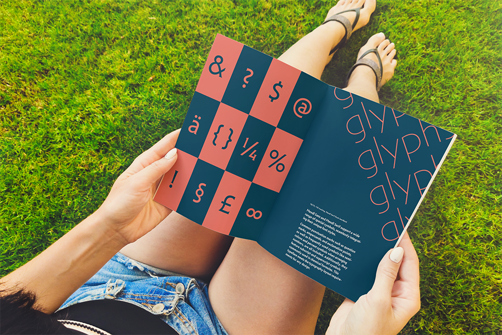
This type promotion project introduces Mendl Sans and Mendl Serif, showcasing their distinct Dawn and Dusk variations. Through two mirrored booklets, the project highlights contrast and cohesion, demonstrating how typography shifts between soft clarity and bold presence. The goal is to reveal the duality of type, emphasizing how structure and fluidity coexist in a dynamic visual system.
Designed as left-to-right and right-to-left booklets, the two volumes mirror each other—one representing Dawn with warm, bright tones and the other Dusk with deep, bold hues. Each booklet explores letterform characteristics, composition, and expressive applications, using juxtaposition, layered typography, and dynamic layouts to emphasize the relationship between order and chaos, structure and rhythm.