02
- Icon Design System
- Brand identity
- ui design
- design systems
- Minimal Geometry
- Structural Clarity
- Visual Cohesive
| Hue+Echo · Contract Design |
| Visit Website → MNM Architecture |
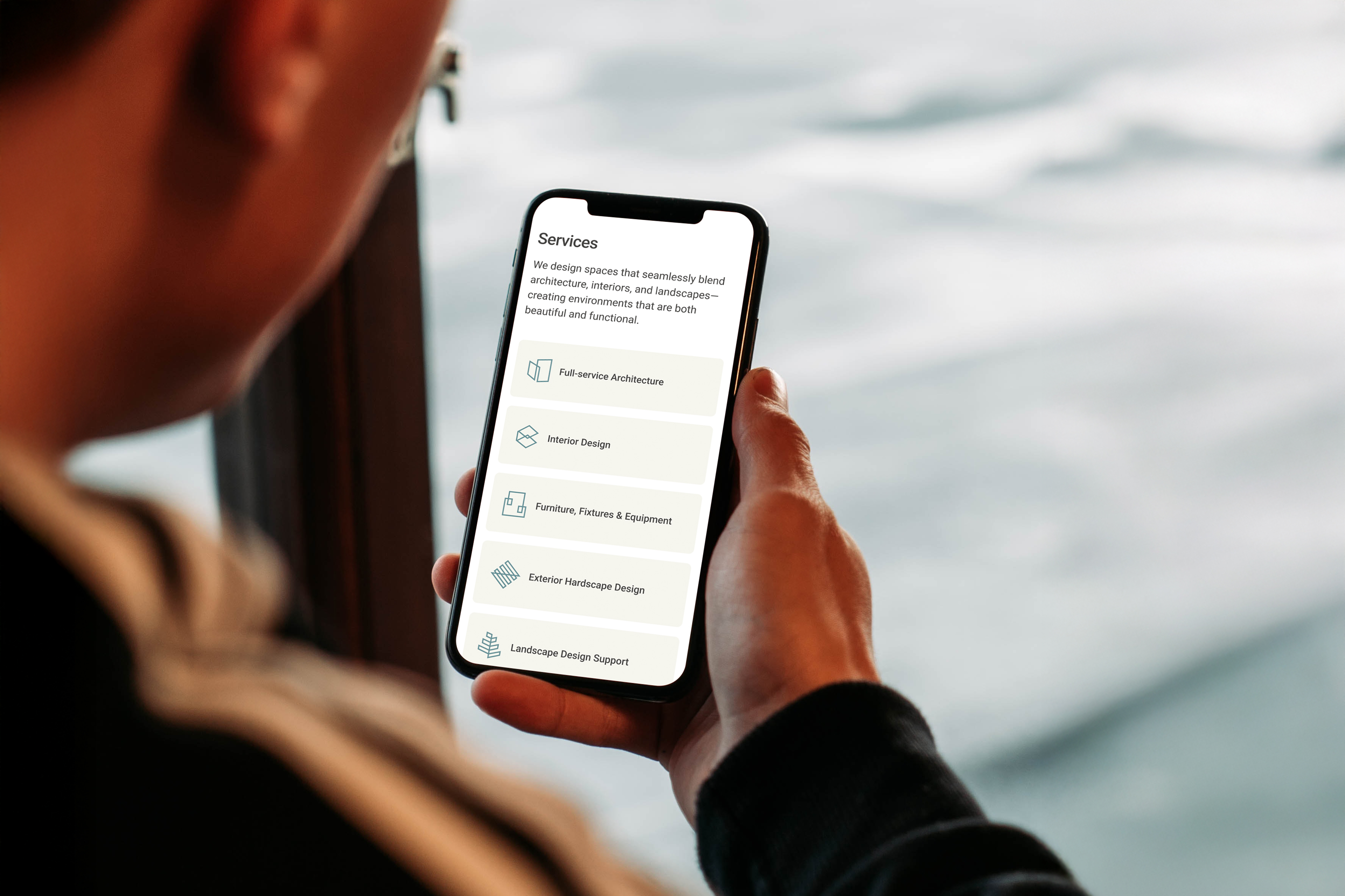
MNM Architecture designs environments that seamlessly blend architecture, interiors, and landscape—balancing functionality with refinement. As the studio expanded its digital presence, the website required a unified icon system to represent core services with clarity and consistency. This project aimed to create a set of custom icons that align with MNM’s brand language while supporting intuitive navigation across both desktop and mobile experiences.
The icon system was developed through an abstract and architectural lens, using clean geometry, continuous line weight, and simplified forms that echo MNM’s design philosophy. Each icon distills a service into a minimal structural symbol—suggesting spatial depth, layering, and built environments without becoming overly literal. Guidelines for sizing, stroke weight, and responsive application ensured cohesion across layouts, allowing the icons to function as both navigational tools and extensions of the studio’s visual identity.
